The Psychology of Color in Portfolio Design: What Your Color Choices Say About You
Why Color Is Never Just Aesthetic
Color communicates before a single word is read. Within milliseconds of landing on your portfolio, a viewer has already formed an emotional impression — and that impression is driven almost entirely by your color choices.
This isn't speculation. Research in color psychology consistently shows that color accounts for up to 90% of snap judgments about products, environments, and people. Your portfolio is no different. The palette you choose signals your sensibility, your professionalism, and the kind of work you're likely to produce — all before an art director scrolls past the header.
What makes this especially relevant for creative professionals is that your portfolio is your work. A graphic designer with a chaotic, inconsistent color scheme is essentially handing a client evidence of poor visual judgment. An illustrator with a palette that feels cold and corporate might repel the editorial clients who would otherwise love her work. Color isn't decoration here — it's data.
The good news: once you understand how color functions as a communication tool, you can make deliberate choices that align your portfolio's visual tone with the exact impression you want to make.
What Common Portfolio Colors Signal to Viewers
Different colors carry distinct psychological associations, and in the context of creative portfolios, those associations become amplified because your audience — clients, art directors, recruiters — are visually literate people who read design choices instinctively.
- Black and charcoal: Authority, sophistication, editorial edge. Common in fashion, luxury branding, and high-end photography portfolios. Risks reading as cold or unapproachable if not balanced with warmth elsewhere.
- White and off-white: Clarity, precision, minimalism. The default for many UX designers and architects — it signals that the work should speak without distraction. Can feel generic if the layout doesn't compensate with strong typography or spacing.
- Navy and deep blue: Trustworthiness, reliability, quiet confidence. Works well for UX designers, brand strategists, and anyone pitching to corporate clients who need to feel reassured.
- Red and terracotta: Energy, urgency, passion. Effective as an accent for illustrators or motion designers who want to signal boldness, but risky as a dominant background — it competes with the work itself.
- Earth tones (ochre, sage, rust): Warmth, craft, authenticity. Popular among surface pattern designers, ceramicists, and editorial illustrators. Signals a handmade sensibility and approachability.
- Pastels: Gentleness, whimsy, accessibility. Strong fit for children's book illustrators or lifestyle brands, but may undercut perceived seriousness for designers seeking senior roles.
None of these are inherently good or bad choices. The question is whether the signal matches your intent.
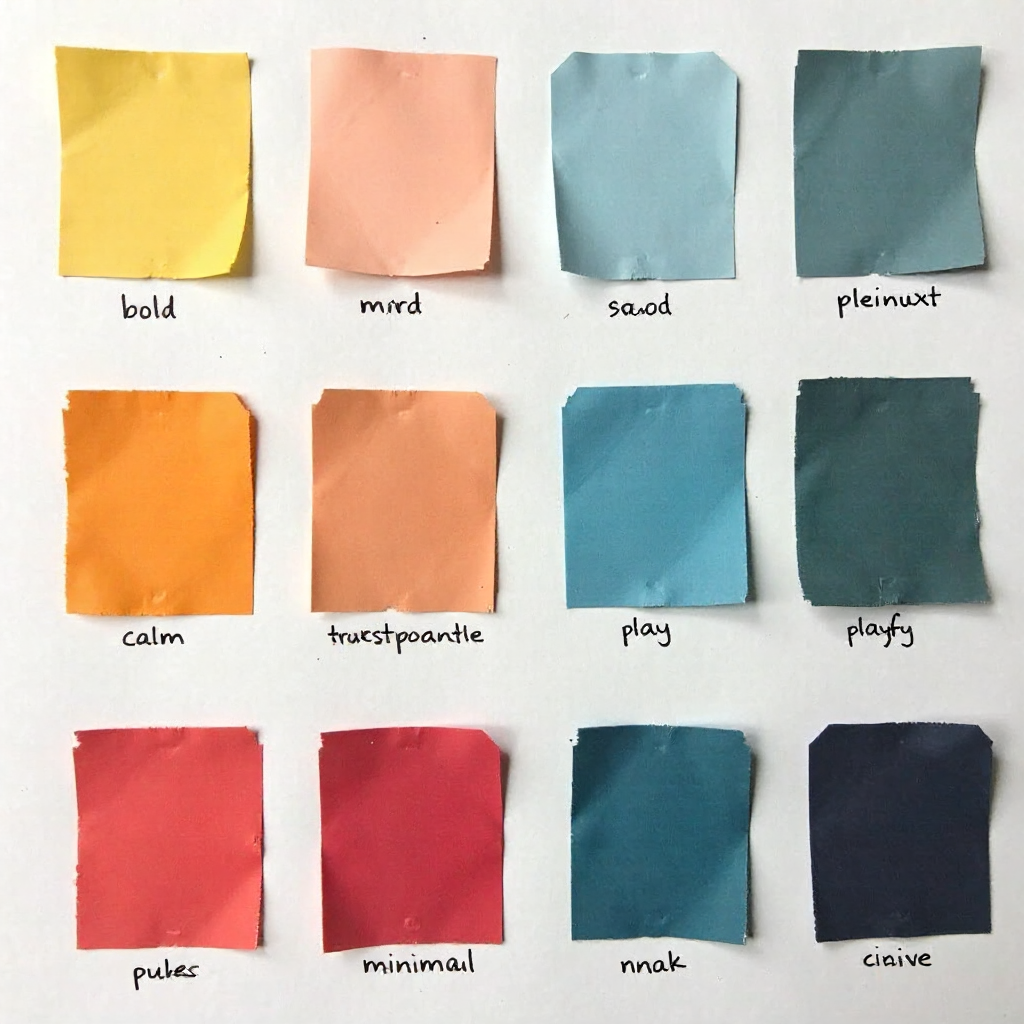
Warm Tones vs. Cool Tones — The Personality Divide
Warm palettes project energy, approachability, and creative passion; cool palettes communicate calm, precision, and analytical thinking. This divide maps fairly cleanly onto different creative disciplines — and onto what different clients expect.
An illustrator working in editorial or children's publishing often benefits from warm undertones. Amber, coral, warm cream — these colors make a portfolio feel inviting and human. They suggest someone who brings personality and emotional warmth to their work, which is exactly what those clients are buying.
A UX designer, on the other hand, is often selling clarity and systematic thinking. Cool blues, slate grays, and clean whites reinforce the message that this person brings order to complexity. The emotional response triggered by a cool palette is trust in process — which is precisely what a product team hiring a UX designer needs to feel.
Fine artists occupy interesting middle ground. A painter whose work is expressionistic and emotionally raw might choose a warm, textured portfolio palette to match that energy. A sculptor working in concrete and steel might lean cool and architectural. The palette should feel like a natural extension of the work — not a contradiction of it.
One practical test: pull the three most dominant colors from your five strongest portfolio pieces. Do they lean warm or cool? Your portfolio palette should echo that tendency, not fight it.
How Your Color Choices Reflect Your Personal Brand
Your portfolio's color palette is one of the most direct expressions of your personal brand — it signals what you value, how you work, and who you're for. Treating it as an afterthought is a missed opportunity.
Personal branding in creative fields isn't about self-promotion in a corporate sense. It's about consistency and legibility: making it easy for the right clients to recognize that you're exactly what they need. Color is one of the fastest ways to establish that recognition.
Consider two illustrators with equally strong work. One uses a portfolio with muted, sophisticated earth tones and clean white space. The other uses bright, maximalist color with playful typography. Both are valid — but they will attract very different clients. The first signals editorial restraint and art-book sensibility. The second signals energy and commercial appeal. Neither is better; they're just different brand identities communicated through color.
The mistake many designers make is choosing colors they personally love without asking whether those colors align with the brand identity they're building. Self-awareness here is a genuine design skill. Ask yourself: what do I want clients to feel within three seconds of seeing my portfolio? Then work backward to the palette that produces that feeling.
Matching Your Palette to Your Target Audience
The most effective portfolio color palette isn't the one you love most — it's the one that resonates with the specific people you want to hire you. Audience expectations should be a primary input in your color decisions, not an afterthought.
Think about the visual language of the industries you're targeting:
- Luxury and fashion clients expect restraint. Black, white, gold, deep neutrals. Anything too bright or playful reads as amateur in those contexts.
- Tech startups often respond well to clean interfaces with confident accent colors — electric blue, green, or orange against white or dark backgrounds. It mirrors their own product aesthetic.
- Editorial and publishing clients tend to appreciate portfolios with personality and a point of view. Unexpected color combinations signal creative range.
- Galleries and fine art institutions often prefer near-neutral backgrounds that don't compete with the artwork — white, warm gray, or black depending on the work's tone.
- Children's and educational brands actively want warmth and approachability, so a more expressive palette can actually signal alignment with their needs.
This doesn't mean abandoning your aesthetic entirely to please a client category. It means understanding where your natural palette already aligns with audience expectations — and where you might need to make strategic adjustments.
Common Color Mistakes in Portfolio Design (and What They Communicate)
Certain color choices consistently undermine otherwise strong portfolios — not because the colors are wrong in isolation, but because of what they signal to a trained eye.
Using Too Many Colors
A portfolio with five or more distinct colors in the interface (not in the work itself) reads as indecisive. It suggests someone who hasn't developed a clear visual point of view — which is a significant concern for clients hiring a designer to make visual decisions on their behalf. Limit your interface palette to 2–4 colors maximum.
Clashing Palette and Work
When a portfolio's background or accent colors actively fight with the work displayed on it, viewers experience visual discomfort they often can't articulate — they just feel vaguely unsettled. A warm, earthy interface showing cool, high-contrast photography creates this tension. The portfolio frame should support the work, not compete with it.
Choosing Trendy Colors Over Authentic Ones
Every year there's a color of the year, a trending palette on design platforms, a dominant aesthetic on social media. Chasing those trends means your portfolio will look dated in 18 months and indistinguishable from everyone else's today. Trends can inform your choices, but they shouldn't drive them.
Ignoring Contrast and Accessibility
Low-contrast text on colored backgrounds isn't just an accessibility issue — it signals carelessness about user experience, which is particularly damaging for UX designers or anyone whose work involves interface design. Visual hierarchy depends on contrast, and if your portfolio's text is hard to read, viewers leave. The Web Content Accessibility Guidelines (WCAG) recommend a minimum contrast ratio of 4.5:1 for body text — a useful benchmark even for purely visual portfolios.
Building a Color Palette That Feels Authentically Yours
A strong portfolio palette starts with intention, not inspiration boards. Here's a practical approach to building one that works both psychologically and aesthetically.
Step 1: Audit Your Existing Work
Pull your ten strongest pieces and identify the dominant colors across them. Look for recurring hues, temperature tendencies, and saturation levels. This is your natural palette — the one that already reflects how you see and work. Your portfolio interface should echo it, not contradict it.
Step 2: Choose a Foundation Color
Pick one background or dominant color that reflects the emotional tone you want to establish. This is your anchor. Everything else should work in relation to it. For most portfolios, this is either a neutral (white, off-white, charcoal, black) or a very desaturated version of a color with personality.
Step 3: Add One Accent Color with Intent
Your accent color does the psychological work — it's what viewers remember and associate with you. Choose it deliberately based on the signals you want to send. A single well-chosen accent is more memorable than three competing ones. Consider complementary or analogous color schemes when selecting your accent: complementary pairs (opposite on the color wheel) create energy and contrast; analogous combinations (adjacent hues) feel harmonious and cohesive.
Step 4: Test Against Your Work
Mock up your palette with actual pieces from your portfolio before committing. Check that the interface colors don't overpower the work, that text is legible at multiple sizes, and that the overall impression matches the brand identity you're aiming for.
Step 5: Get Outside Eyes
Ask someone who doesn't know your work to describe the feeling they get from your portfolio in three words. If those words don't match what you intended, the palette — or the overall design — needs adjustment. This feedback loop is the fastest way to catch misalignments between your intent and your viewer's actual emotional response.
Color is one of the most powerful tools in your portfolio — and one of the most underused. Most designers default to safe neutrals or personal favorites without asking what those choices actually communicate. The ones who get intentional about it tend to attract the clients they actually want.
Frequently Asked Questions
Does background color in a portfolio matter as much as accent colors?
Background color sets the overall emotional tone and affects how your work is perceived — so yes, it matters enormously. A warm cream background makes the same artwork feel different than a stark white or a deep charcoal. That said, accent colors tend to be more memorable because they carry more visual weight relative to their size. Both decisions deserve equal thought.
Should my portfolio colors match the colors I use in my actual artwork or design work?
They don't need to match exactly, but they should feel tonally consistent. If your work is bold and saturated, a muted beige portfolio interface creates a disconnect. If your work is delicate and pastel, a high-contrast dark portfolio can feel jarring. Harmony between the frame and the content builds coherence — and coherence signals intentionality.
Can using too few colors make a portfolio look unfinished?
Rarely. Restraint in color is almost always read as sophistication, not incompleteness — provided the typography, spacing, and layout are doing their job. A two-color portfolio with strong visual hierarchy looks more considered than a five-color one without clear structure. The risk with too few colors is monotony, which you solve with contrast and variation in tone, not by adding more hues.
How do I choose a portfolio color palette if I work across multiple styles or disciplines?
Focus on the emotional throughline of your work rather than trying to represent every style visually. What feeling connects your most diverse pieces? Start there. A neutral, flexible palette often works best for multi-disciplinary creators — it steps back and lets the range of work speak without the interface taking sides.
Is dark mode or light mode better for creative portfolios?
Neither is universally better — it depends on your work and your audience. Dark backgrounds make photography and digital illustration pop with high contrast and drama. Light backgrounds tend to suit print work, illustration, and anything where you want a clean, editorial feel. If your work spans both, a light mode portfolio is generally safer because it's more legible across different screen types and lighting conditions.